Smart Systems. Real Connections.
Fast Response • Personal Support
Serving the Mid-Ohio Valley
Calls • Texts • Scheduling • Reviews
Resources

Fast Response

Flexible Solutions

Personal Support

Affordable Pricing

Built for Small Business

Local + Remote Support
RESOURCE CENTER
Practical guides, strategies, and inspiration to help you improve customer communication, follow-up, marketing, websites, and the systems that power your success.
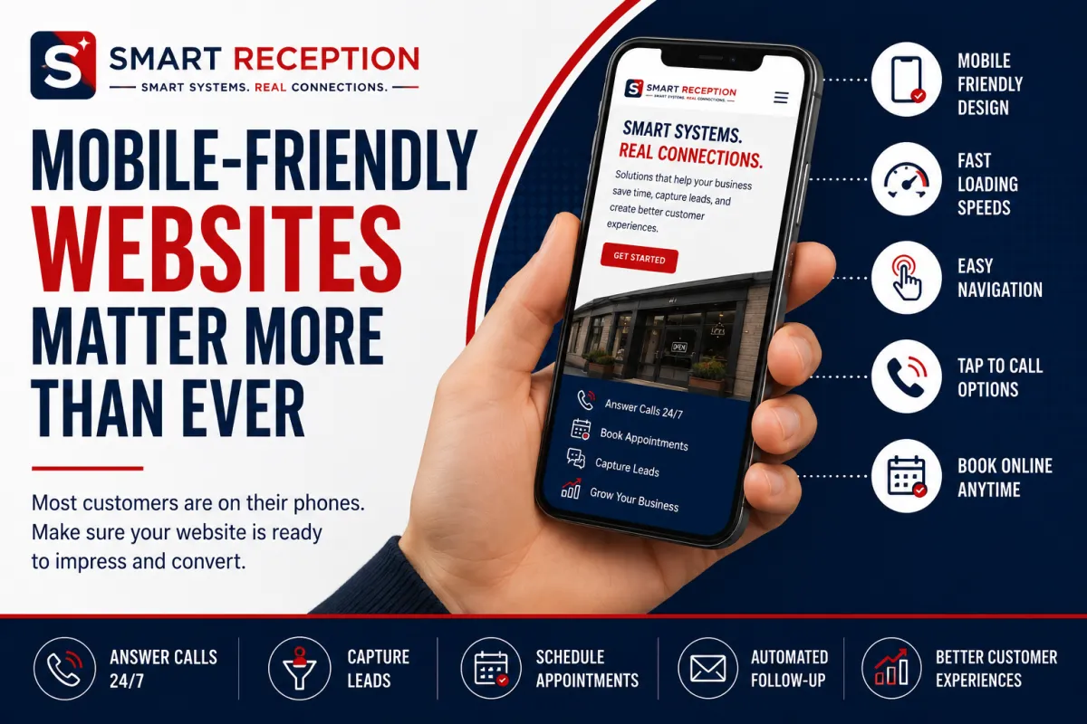
Why Mobile-Friendly Websites Matter More Than Ever in 2026
Small Business, Mobile-Friendly Websites, Local Marketing, Smart Reception
Why a Mobile-Friendly Website Is Essential for Small Businesses in 2026
In 2026, your website is often the first “receptionist” a potential customer meets—and most of the time, that introduction happens on a smartphone. For local businesses, a mobile-friendly website is no longer a nice upgrade. It is a basic requirement for being found, trusted, and chosen. In this article, Smart Reception explains why mobile readiness matters so much today, how poor mobile design silently drives customers away, and what practical steps you can take to evaluate and improve your mobile experience.
Your Customers Live on Their Phones—Your Website Has to Follow
Globally, there are about 5.83 billion unique mobile phone users—roughly 70% of the world’s population—and smartphones account for nearly 89% of all handsets in use (DataReportal, 2026). In the United States, smartphone ownership is almost universal among adults under 50, and even 78% of people over 65 own one (Pew Research, 2026). That means your next customer is overwhelmingly likely to meet your business on a phone screen, not a desktop monitor.
For local businesses—contractors, home services, salons, medical offices, law firms, auto repair shops, and other service-based companies—this shift is even more pronounced. People pull out their phones in the moment they need help: when the sink is leaking, a tooth hurts, or they realize they forgot to book their car inspection. If your site does not load quickly and work smoothly on that small screen, you are effectively closed for business, even if your doors are open.
How Customers Use Smartphones to Find and Engage With Local Businesses
1. Searching for Local Businesses
Most local customer journeys now start with a mobile search. Someone types “emergency plumber near me,” “family dentist in [your city],” or “best hair salon open now” into their phone. Search engines, maps, and local directories surface options, and users tap the listings that look most relevant and trustworthy. If your website is not mobile-friendly, you are less likely to appear near the top—and even if you do, visitors may bounce as soon as they see a clunky, desktop-only layout.
2. Browsing Services on the Go
Once customers land on your site, they want to quickly browse your services on their phone. They are asking:
Do you offer exactly what they need?
What areas do you serve, and what are your hours?
Are your prices, process, or insurance policies clear?
A mobile-friendly website presents this information in short, scannable sections with clear headings, bullet points, and tap-friendly navigation. If visitors have to pinch and zoom, scroll sideways, or hunt through cluttered menus, many will simply back out and choose a competitor whose site feels easier to use.
3. Calling Your Business With One Tap
One of the biggest advantages of mobile is immediacy. Customers expect to tap a phone number or a “Call Now” button and connect instantly. If your number is buried in tiny text, not clickable, or hidden on a separate page, you introduce friction at the exact moment someone is ready to contact you. A mobile-optimized site makes calling effortless with prominent, thumb-friendly call buttons at the top and bottom of key pages.
Smart Reception often sees dramatic increases in inbound calls when small businesses simply add clear tap-to-call buttons and ensure their phone number displays correctly on mobile devices. It is a small change that can rescue a lot of missed opportunities.
4. Requesting Information and Quotes
Not everyone wants to call immediately. Many customers prefer to request information, ask a question, or get a quote through a mobile form, text, or chat. On a mobile-friendly website, these options are easy to find and simple to complete. On a poorly designed site, forms may be too small, fields may be hard to tap, and error messages may be confusing or hidden. Each of these frustrations increases the chance that a potential lead gives up halfway through.
5. Booking Appointments From Their Phone
In 2026, customers expect to book appointments online at any hour—without waiting for office hours or sitting on hold. From salon visits and dental cleanings to legal consultations and auto repairs, mobile appointment scheduling is quickly becoming the norm. A mobile-friendly booking experience with large buttons, clear time slots, and confirmation messages can turn a casual browser into a confirmed appointment in under a minute. When Smart Reception connects mobile-friendly websites with automated scheduling and reminders, businesses see more bookings and fewer no-shows with less manual work.
How Poor Mobile Design Quietly Costs You Customers
If your website was built years ago with only desktop in mind, it may be actively pushing customers away without you realizing it. The most common problems are surprisingly simple—and incredibly damaging to your bottom line.
Slow Loading Speeds on Mobile Connections
Mobile visitors are often on the go, using cellular data instead of fast office Wi‑Fi. Heavy images, unoptimized videos, and bloated code can make pages take several seconds—or longer—to load. On a smartphone, a delay of even three seconds can cause visitors to abandon the page and tap another result. With global mobile data traffic up 22% and 5G carrying about half of all mobile data (Institute of Internet Economics, 2026), speed is both an expectation and a competitive advantage.
Difficult Navigation on Small Screens
Menus designed for a large monitor do not translate well to a 6‑inch screen. If your navigation links are tiny, crammed together, or require precise tapping, visitors can quickly feel lost or frustrated. A mobile-friendly site uses simple, collapsible menus (often called “hamburger menus”), clear page titles, and logical groupings of content so users can find what they need in two or three taps, not ten.
Tiny Text and Hard-to-Read Content
If customers have to pinch and zoom just to read your hours, address, or pricing, your site is not truly mobile-friendly. Tiny text forces extra effort and can be especially challenging for older visitors or those with vision difficulties. Modern mobile design uses larger base font sizes, generous line spacing, and strong contrast between text and background. This is not just about aesthetics; it is about accessibility and respect for your customers’ time and comfort.
Hard-to-Use Forms and Tiny Tap Targets
Forms are often where leads are won or lost. On a non-optimized site, form fields may be too small, placed too close together, or not configured with the right mobile keyboard (for example, showing a letters keyboard for a phone number field). Buttons might be so small that users accidentally tap the wrong element—or give up entirely. Good mobile design uses large, clearly labeled fields, minimal required inputs, and big, easy-to-tap buttons that work well even for people with larger fingers or when using one hand.
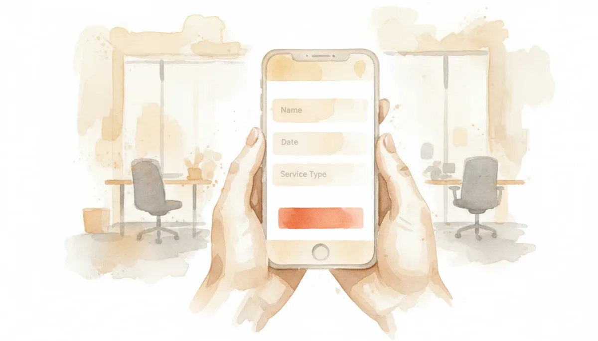
Simple, tap-friendly forms dramatically increase completed inquiries and booked appointments.
The Business Case: How Mobile-Friendly Sites Drive Results
Better Customer Experience = Happier, More Loyal Clients
A mobile-friendly website improves the overall customer experience by making every interaction smoother: searching, browsing services, calling, requesting information, and booking appointments. When visitors can easily complete their goals without frustration, they are more likely to trust your business, return in the future, and recommend you to others. This aligns directly with Smart Reception’s belief that every customer deserves a prompt, professional response—online and on the phone.
Credibility in a Competitive Local Market
Customers judge your professionalism in seconds. A modern, mobile-optimized site signals that you are current, organized, and serious about serving your clients. An outdated site with poor mobile design can send the opposite message: that your processes may be just as outdated as your website. For medical offices, law firms, and other trust-based services, credibility is everything. A polished mobile experience reinforces that you are a reliable, detail-oriented provider.
Stronger Lead Generation and Conversions
Mobile-friendly websites make it easier for visitors to become leads and customers. Clear calls-to-action—such as “Call Now,” “Request a Quote,” or “Book an Appointment”—guide users toward the next step. Fast load times and simple forms reduce drop-offs. When Smart Reception combines a strong mobile site with AI-powered virtual reception, missed-call text back, and automated follow-up, businesses often see a significant increase in:
Inbound calls and messages from mobile visitors
Completed quote requests and consultation forms
Confirmed appointments and paid bookings
In other words, a mobile-friendly site does not just look better—it converts better. It turns casual browsers into real revenue.
Improved Search Visibility in 2026’s Mobile-First World
Search engines have used mobile-friendliness as a ranking factor for years, and by 2026, mobile-first indexing is the norm. That means search engines primarily evaluate the mobile version of your site when deciding where to rank you. If your site is slow, hard to use, or not responsive on mobile, your search visibility will suffer—especially for “near me” and local intent searches that are so critical for small businesses.
A mobile-optimized site with fast load times, clear content, and strong engagement signals (like visitors spending time on your pages instead of bouncing) sends a powerful message to search engines: this is a site that satisfies users. The result is better rankings, more organic traffic, and more opportunities to win new customers without paying for every click.
Practical Ways to Check If Your Website Is Truly Mobile-Friendly
You do not need to be a web developer to evaluate your mobile experience. Here are straightforward tests any small business owner can run today to see whether your site delivers a strong mobile experience—or is quietly costing you leads.
1. The “Phone-Only” Test
Put your computer aside and pretend you are a new customer. On your smartphone:
Search for your business name and your main service (for example, “Smith Dental teeth cleaning”).
Tap your website result. How long does it take to load?
Without zooming, can you clearly see what you do and where you are?
Can you find your phone number, services, and booking options in under 10 seconds?
If you feel even slightly frustrated, imagine how a first-time visitor feels. That friction translates directly into lost leads and missed revenue.
2. Check Text Size, Buttons, and Forms
On your phone, review a few key pages: your home page, services page, and contact or booking page. Ask yourself:
Is all the text readable without zooming, even for someone with weaker eyesight?
Are buttons large enough to tap comfortably with your thumb, with space around them to avoid accidental taps?
Do forms fit nicely on the screen, or do you have to scroll sideways?
Try completing your own contact form or booking form on your phone. Time how long it takes and note any points where you hesitate, retype, or feel confused. Those are the exact places where customers drop off.
3. Use Free Online Mobile Tests
Several free tools can give you an objective view of your mobile performance:
Mobile-friendliness tests from search engines highlight issues like tiny text, content wider than the screen, and clickable elements that are too close together.
Page speed tools show how quickly your site loads on mobile networks and which elements slow it down.
You do not need to understand every technical detail. Focus on the big issues: load time, mobile layout, and usability. A partner like Smart Reception or your web designer can help you interpret the results and prioritize improvements.
4. Ask Real Customers for Feedback
Some of the best insights come directly from the people you serve. Ask a few regular customers—especially those in different age groups—to pull up your site on their phones and walk you through their experience. Listen for comments like:
“I had trouble finding your phone number.”
“The text is a bit small.”
“The form was long; I almost didn’t finish it.”
These are not criticisms—they are opportunities to make your site more welcoming, accessible, and effective at turning visitors into customers.
5. Track Mobile Leads and Conversions
Finally, look at the numbers. If you use basic analytics, check how many visitors come from mobile devices, how long they stay, and how often they complete key actions (calls, form submissions, bookings). If mobile traffic is high but conversions are low, that is a strong signal that your mobile experience is not working as hard as it should be.
Smart Reception can help you go a step further by connecting your website to AI-powered call tracking, missed-call text back, and CRM automation. This gives you a clearer picture of how many mobile visitors turn into leads, how quickly you respond, and where you might be losing opportunities.
Turning Your Website Into a 24/7 Mobile Receptionist
A mobile-friendly website is more than a digital brochure. It is the foundation of a modern customer communication system that works around the clock. When your site loads quickly, looks great on any device, and makes it easy to browse services, call, request information, and book appointments, it functions like a reliable virtual receptionist—one that never takes a lunch break or goes on vacation.
At Smart Reception, we extend that experience beyond your website. Our AI-powered virtual receptionist answers calls, sends missed-call text backs, manages appointments, and feeds everything into your CRM so no opportunity slips through the cracks. When your mobile-friendly site and your communication systems work together, you create a seamless journey from first search to final booking:
Customers find you easily on their phones.
They understand your services and trust your brand.
They can call, text, or book in seconds—day or night.
Every inquiry is captured, responded to promptly, and tracked.
Final Thoughts: Don’t Let an Outdated Mobile Experience Hold You Back
By 2026, mobile is not a trend—it is the default way people interact with businesses. With billions of smartphone users worldwide, hours of daily mobile screen time, and mobile commerce driving a majority of retail sales, the stakes for small businesses have never been higher. A website that is slow, hard to navigate, filled with tiny text, or built on clumsy forms and hard-to-tap buttons does more than frustrate visitors; it actively undermines your customer experience, credibility, lead generation, conversions, and search visibility.
The good news is that improving your mobile experience does not require a massive, complicated project. Start with simple tests on your own phone, gather feedback from real customers, and use free tools to identify the biggest issues. Then, focus on the fundamentals: responsive design, fast loading, clear navigation, readable text, and frictionless forms and buttons. Each improvement makes it easier for customers to find you, trust you, and choose you.
Smart Reception exists to help small businesses like yours never miss another opportunity. If you are ready to turn your website into a truly mobile-friendly, lead-generating asset—and connect it with AI-powered reception, appointment scheduling, CRM automation, and review management—we are here to help.
📌 Next Step: Schedule a free consultation today to discover how Smart Reception can help your business answer more calls, capture more leads, automate customer communication, and grow with confidence—starting with a mobile experience your customers will love.

Ready to work smarter?
We've got your business connected.

Empowering businesses with innovative solutions, we are committed to providing seamless support and fostering growth. Connect with us for a brighter, smarter future!
CONTACT
(304) 396-6903
Vienna, West VirginiaServing the Mid-Ohio Valley & remotely
© Copyrights 2026 | Smart Reception | All rights reserved.